
The Context
As I was (somewhat blindly) perusing the Library of Congress prints and photographs database, I came across a collection1 of maps showing various demographic data about African Americans living in Georgia around the year 1900. The first map I came across (Figure 1) initially caught my attention because of a striking similarity to a source we looked at in class. Have you guessed what yet?
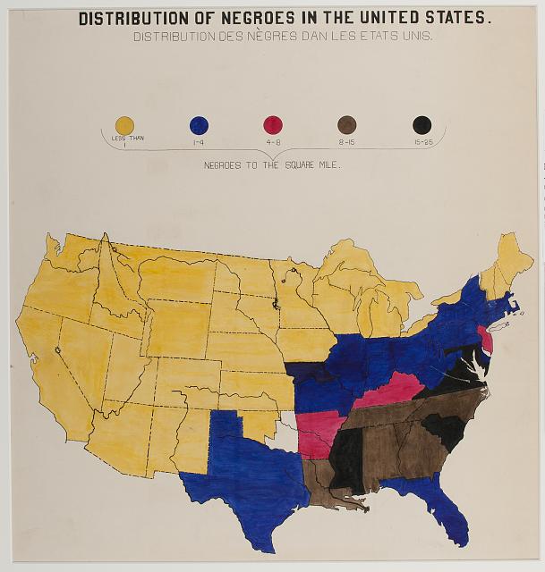
Figure 1. The very first map I came across. Look familiar?
Yeah. It’s George Pullen Jackson’s book titled “White and Negro Spirituals: Their Life Span and Kinship2.” More on that later. I decided to look at this collection of maps and the more I read about them, the more interested I became. According to the Library of Congress’ entry about this collection, the maps are part of a collection titled “Charts and graphs showing the condition of African Americans at the turn of the century exhibited at the Paris Exposition Universelle in 1900.” These images were collected to “show the economic and social progress of African Americans since emancipation.” In his book “W.E.B Du Bois’s Exhibit of American Negroes3“, author Eugene F. Provenzo writes “the Exhibit of American Negroes was a collaborative creation of Black colleges and universities and the Library of Congress” (1). In Du Bois’ own words, his collection intended “…to give, in as systemic and compact a form as possible, the history and present condition of a large group of human beings” (Provenzo 3). The title page of the exhibit displays the famous quote: “The problem of the 20th century is the problem of the color-line” (Provenzo 1). In short, Du Bois’ display was featured at the 1900 World’s Fair in Paris, and was designed to show the progress of Black Americans primarily living in the south, concentrating in Georgia. His data is taken from the decade of 1890 to 1900.
After seeing and reading about this, my almost immediate thought was “how does this compare to other maps of the area?” And, bingo, there is George Pullen Jackson’s full-page map in all its monochromatic glory (Figure 2).
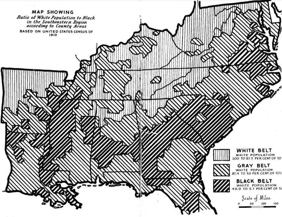
Figure 2. George Pullen Jackson’s map, “White and Negro Spirituals”, pages 280-281.
I could go into lots and lots of historical context here, but I’m going to focus on only the bits that really matter. George Pullen Jackson4 (1874-1953) was a leading scholar in American folksongs and spirituals. He published books on African American spirituals, folksongs, and was widely considered a top authority on Southern hymnody. Jackson published this book and map in 1943. The map, pictured above, is intended to act as a supplement to Jackson’s claim that African American folk songs are derived from the English (white) folk songs that came first.
Now, we know that Jackson’s scholarship is incorrect, dubiously researched, and racist. While upsetting and at times infuriating to read, it’s important to critically analyze sources, keeping in mind the historical context. That being said, Jackson’s main argument is a racist one, and he is trying to manipulate his map to support his claim.
The Comparison:
While both maps are objectively correct when compared to census records from the years 1890 – 1950, it is more important to reflect on what information the map is adding to the claim and how effective it is.
Du Bois’ map, as previously mentioned, was intended to help show the advancements of Black people since the end of slavery, just decades prior. He uses census data to map the distribution (density) of Black people in the United States. Concentrating on the Southeast region, we can see that is where the highest density was at that time. The “deeper” into the South one gets, the darker the colors are, pointing to a greater density of African Americans living in those states.
Jackson’s map, informed from the 1910 census, was somehow proving his point that Black folk songs were “inspired by” the preceding white songs. How? I genuinely do not know. Jackson focuses on the percentages of white population and divides his data into three categories: the “White”, “Gray”, and “Black” belts. Then Jackson goes on to show how these three categories are geographically situated within the South.
These two maps agree in basic information, which can be verified in public census records: in the early 20th century, there was a higher density of African American people living in the Southeast region of the United States than other regions. Standing alone, neither of these two maps really proves a point other than providing a visualization of census data.
This brings me to my main point, which is the importance of including relevant information in a map (or any piece of data for that matter). I believe a good map should be able to be read and understood without a lot of contextual background reading, as Jackson’s requires to fully understand his point.
If there is a point you are not able to support with evidence, perhaps you should reconsider why you believe so strongly in that claim, instead of manipulating data to kinda-sorta prove your point. Not all sources are created equal, and not all sources end up being trustworthy.
Primary Sources:
[1] Du Bois, W. E. B., collector. “Charts and graphs showing the condition of African Americans at the turn of the century exhibited at the Paris Exposition Universelle in 1900.” Collection. https://www.loc.gov/pictures/item/2005679642/
[2] Jackson, George Pullen. White and Negro Spirituals: Their Life Span and Kinship. n.p, 1943.
SECONDARY SOURCES:
[3] Provenzo, Eugene F. W.E.B. Du Bois’ Exhibit of American Negroes: African Americans at the Beginning of the Twentieth Century. Lanham, Maryland: Rowman & Littlefield, 2013.
[4] Jackson, Richard. “Jackson, George Pullen.” Grove Music Online. 2001. https://doi.org/10.1093/gmo/9781561592630.article.14025.