Design & Layout
2018 redesign:
As one effort among many to continue developing, improving and challenging the status quo of journalism at St. Olaf College, in the Fall of 2018 the Executive and News teams decided to spearhead a publication redesign – that is, the first redesign initiative since the early 2000’s.
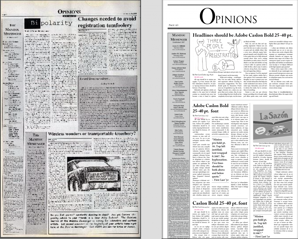 On the left: Opinions Section Dec. 2000
On the right: Redesigned Opinions Section Dec. 2018
In completing design research and formalizing a vision for the newest version of the Mess, we centered the sharp reality that within five years the publication will shift to a digital-only format. This resulted in our plan to create and realize a design that would facilitate such a transformative – yet necessary – shift.
What this meant more specifically was engaging closely with widely-read, professional print publications that also have a digital counterpart. We wanted to see how the two formats were kept consistent via fonts and style, as well as how the print versions were designed to accommodate readers who increasingly read content of all varieties on their cell phones, laptops and tablets. Because so many readers are now used to engaging with digital content, we wanted to integrate digital elements into the print publication, as according to our research, people now read every text as they would a digital text.
What this means more specifically, is that readers no longer read in the “Z” eye scanning pattern to an “F” pattern – the eyes begin by scanning horizontally across the top of a digital screen. They then move down the page and spend time reading only the keywords of the following paragraphs. By the bottom of the page, only the very first words on the left have a chance of audience engagement. Even more important for our research and consequent design, however, was what we learned about audience engagement with different design elements on any given page – less than a quarter of all readers read any of the body text of stories. However, readers engage with design elements such as photos, headlines, pull quotes and captions far more frequently.
As a result, when designing new Manitou Messenger design style guides, we zeroed-in on reader “entry points,” – the very same elements above – to maximize the content readers to engage with by incorporating as much information as possible into the design elements and text which accompany any given story. This meant decreasing words counts on text-based stories and increasing space for stories driven by images, pull quotes, captions and sub headlines. To enhance the aesthetic appeal of the design, we transitioned our previously text-heavy design to incorporate more white space, wider margins and lines to divide different stories.
We encourage future editors of the Mess to allow digital design to inspire print design, and vice versa. As we have discovered through this project, written content is only as accessible, engaging and excellent as its presentation.
Templates:
Listed below are the InDesign templates we’ve created for editors to download and use while getting accustomed to the changes …
full layout 1.indt (with directions)
1. When beginning to layout your section for the week, first, be sure you’ve thoroughly read and edited the stories. Take note of how many stories you have and their word counts.
2. Look through the varying templates on the Edit Desk or from past issues that use the new design. Find one that matches your number of stories and rough word counts. This will help limit the amount of adjustment needed.
3. Click the link to download the file.
4. Click file > save as > and enter that week’s date of publication. (i.e. 10.5.18). Be sure the file is saved in the correct section and year folders in the Manitou Messenger shared drive.
5. Now you are set to begin work! Be sure to replace all the filler text with the correct stories, bylines with correctly spelled names, etc. You will need to change spacing and lines as you go, but remember to maintain white space where possible and incorporate visual elements into your design. Remember to go through and check that fonts, sizes and spacing are consistent with the guidelines provided on the templates. If you need help or want a special graphic or design element on your page, ask or contact the Manitou Messenger Visual Director at mess-visual@stolaf.edu.
Resources for design:
Want to learn how to use master pages? Or how to change gutter sizes or margins? Or just how to insert photos? Check out these InDesign tutorials.
UX Planet is a website of articles all about creating designs according to the user experience. The article linked describes the psychological principles essential to the design process (Gestalt Principle, psychology of colors, eye scanning patterns).
6 principles of visual hierarchy for designers: design basics about page scanning patterns, the fact that bigger actually is better, the importance of spacing, color, fonts and direction of text.
Inspiration: 50 Incredible Editorial Designs from Around the World, Origen Newspaper, Epoch Times Newspaper Designs, BIG Typography Design