Design
User Experience Design
Select projects and case studies from 2023 -2024 are displayed on my UX Portfolio. Click the image below to view each project.
TechLabs Berlin Final Project:
As the UX designer on the team, I developed a survey, gathered responses, and performed some informal interviews with social workers to get some more concrete data and direction. From the results, we learned that:
- Respondents’ top 3 social services were – women’s health/support, education support/local libraries, mental health services * Note – data slightly skewed because 95% of respondents identified as women
- Majority of respondents, 86.4%, perform a general internet search when seeking local services
- 79.5% use Google Maps to search 90.9% are seeking information about the services offered, 63% are looking for contact info
- 61.4% struggle with relevancy of information, 52.3% struggle with availability of information
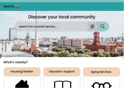
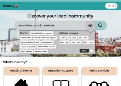
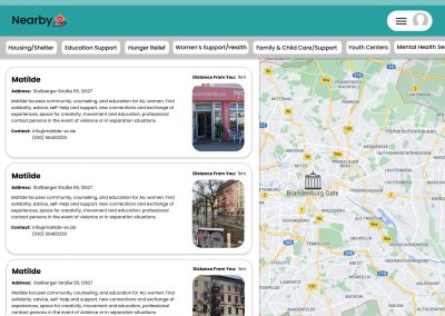
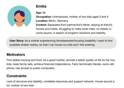
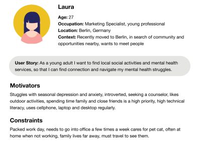
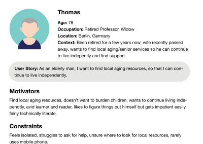
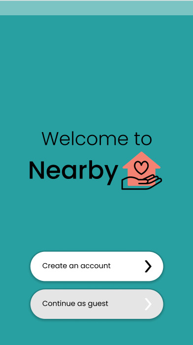
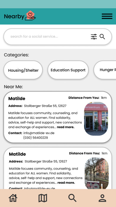
These results helped guide our next design decisions. Once we began to understand our data limitations, we shifted our focus to be less on the mapping feature and more on the search feature. How people search and access the right information was utmost priority. We also used the survey info to create a few different personas. These also helped to dictate our design choices. After creating some initial designs based on data and personas, and explored user flow, I next translated the designs on to Figma. Throughout the process, we kept our focus on making information accessible, comprehensive, and relevant.
