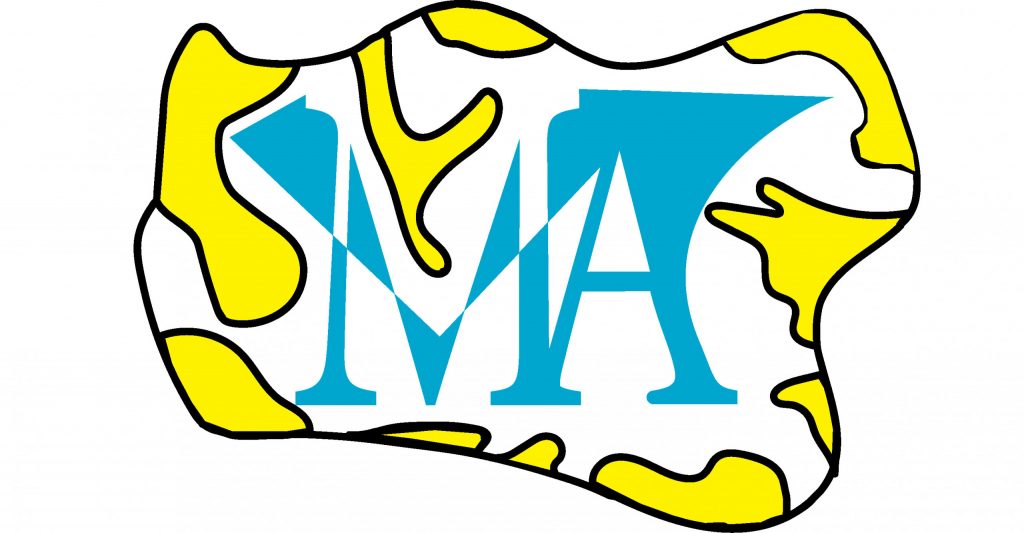
Personal Monogram
As I started exploring How Illustrator works, I became more familiar with the interface and how to build up some designs from scratch.
My first project was building a monogram that has my initials M & A using illustrator and I changed in the fonts and the outer layers designs has lava domes structure where my initials are very symmetrical with inverted colors.
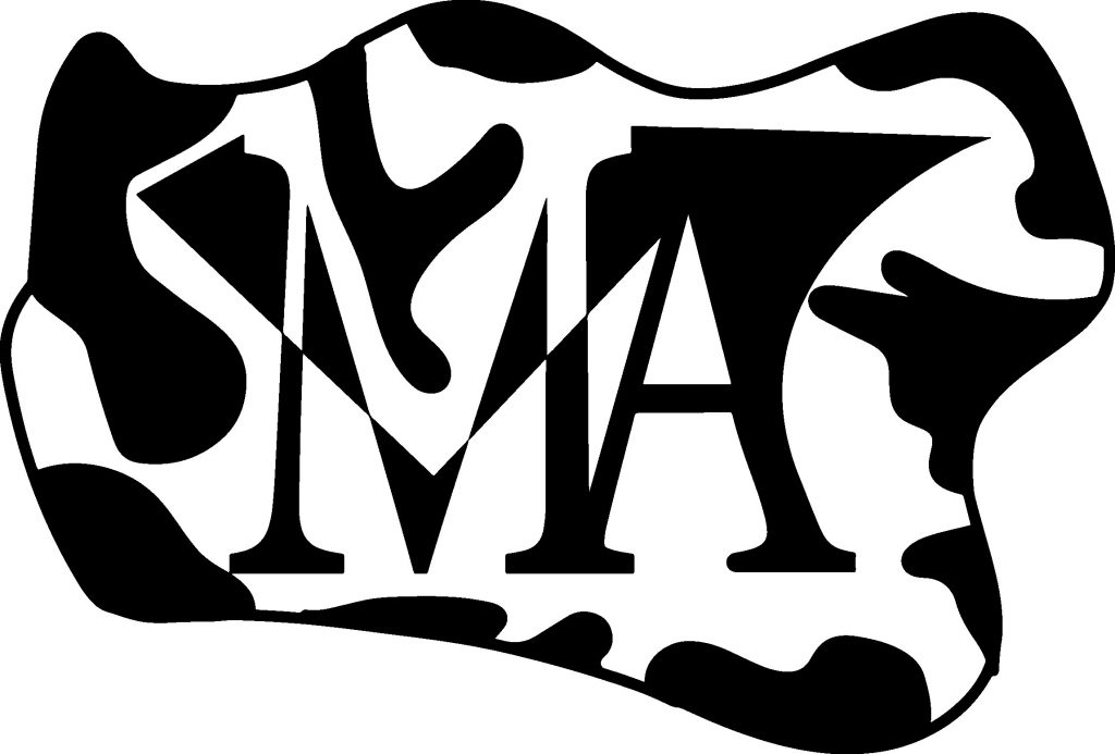
The first design was made in black and white then I chose light blue for the letters and yellow to fill up the structure. After Finishing up the monogram with illustrator, I used UltiMaker 3D design application to build up a 3D model of the monogram that turned out to be a good addition to my Designs
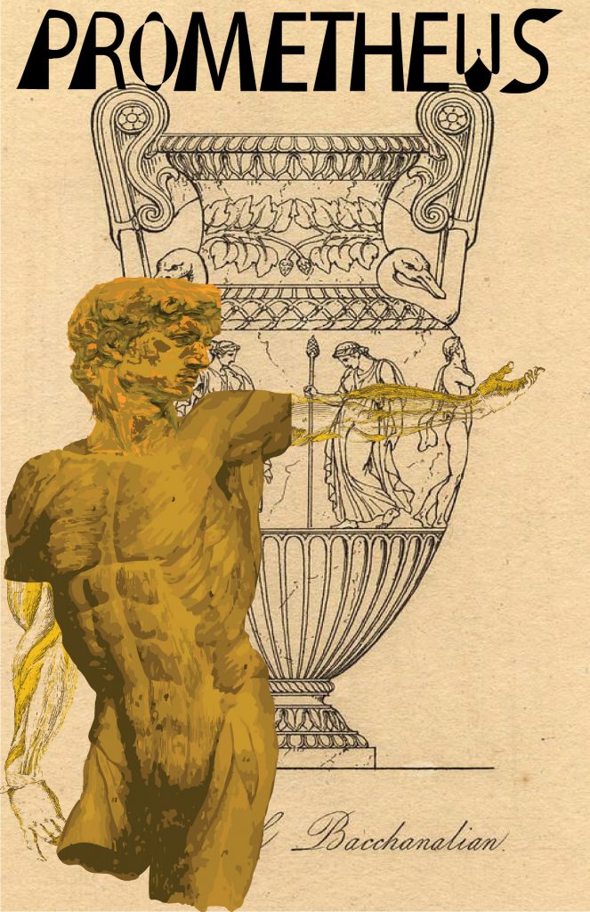
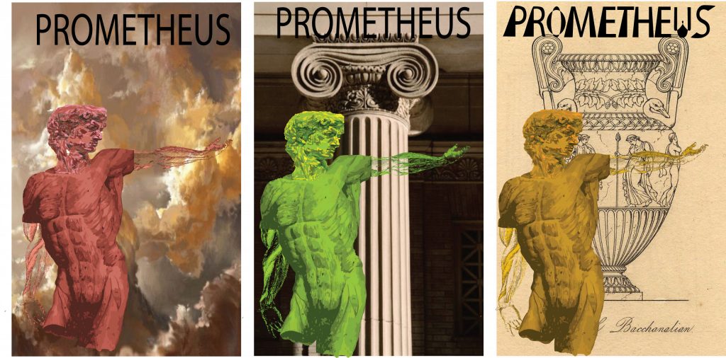
Prometheus Movie Poster
After Building the monogram, I decided to make a film poster that I’m very enthusiastic about. This movie is Prometheus which is inspired by the Greek mythology of the titan prometheus that tried to steal the fire from the gods but the gods knew of his scheme so they decided to banish him and torcher him by tying him to a rock and having his liver being eaten by a giant hound and regrowing the liver indefinitely.
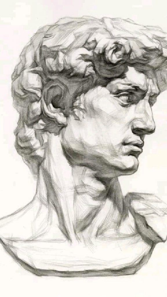
The process of making the poster started by me looking at Ancient Greek statues and taking inspiration from them to build my poster. I started by collecting multiple art pieces and demonstration of the human parts like arms, limbs, head & torso.
So I took the head of David’s statue and changed the background and the colors to have different examples to choose from, through using illustrator tools.
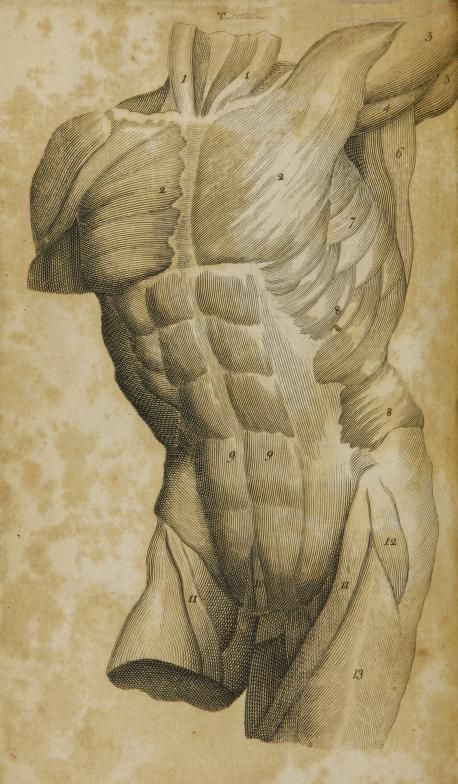
For the torso, I took the picture of a sectioned torso that has muscles definitions which I split the sections of the torso into 3 color palates ignorer to choose certain parts and remove the numbers and some parts that didn’t fit with my design, while I also used 3 different color pallets for the torso design.
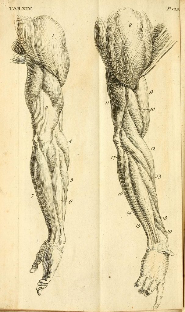
When It comes to the arms, it was the most difficult part because I had to individually isolate muscles groups and remove some structure and definitions for it to look more like the vanes and the minimalistic structure to become more evidant.
For the final presentation I choose 3 different templates with different colors and structures and decided to choose the orange/caramel color as my main piece while also changing the design of the letters to become more coherent with the theme of the art piece.
The Final Product