Shall we graph?
Well, now that I’ve gotten the worst of the puns out of my system, I’ll explain what I mean by the sudden flurry of statistical jargon (not that it was so bad – I wouldn’t spring anything too gnarly at you, dear reader).
Over the course of the semester, our focus has been mainly on the qualitative features of digital mapping. While this is useful, and desirable, the recent visit to our class by Dr. Lincoln Mullen of George Mason University reminded me of the importance of incorporating certain quantitative analyses into the interpretation, if not the design, of even a largely qualitative map.
Depending on the data set, the easiest quantitative analysis to run is basic statistical analysis – in other words, mean, median, mode, standard deviation… These numbers are useful in that they offer a different way to consider the frequency of certain data points. If your map, like mine, happens to have several data points concentrated in one particular location, it can be very difficult to discern all the separate points. There are ways to represent information density, of course; providing some of the statistical analysis simply provides a different way of looking at and often condensing the data.
I started by simply exploring the graph and chart options which Excel was willing to mash my data into automatically (note: I prefer to run these kinds of mathematical analyses in Excel, or on my beloved TI-84 plus calculator. I’m not certain what Google’s capabilities are in this arena, and sometimes it’s best to stick with what you know). The initial results were the following:
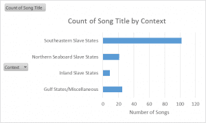
Graph 1
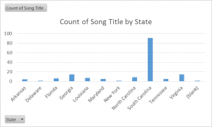
Graph 2
These two charts provide an overview of how many songs there are by regional context and by state, respectively. Like the heat map of the Slave Songs of the United States found under the project page “Mapping Slave Songs of the United States,” the charts make it fairly clear that the editors of the book collected the greater part of their songs from the Southeastern Slave State region, and especially within the boundaries of South Carolina.
What the charts cannot explain, alas, is why: Charles Pickard Ware, William Francis Allen, and Lucy McKim Garrison, the editors, were all Northerners who found themselves in various government/non-profit (a modern word that best encapsulates their purpose) related positions concentrated in or around the Sea Islands off the coast of South Carolina and Georgia. Their research and song-gathering was most intense and purposeful there, near Port Royal, where elsewhere it was fairly haphazard and dependent on contributions by other interested parties.
For this reason, I also chose to chart the number of song titles contributed to the book by the individual cited as source in the Table of Contents, or credited elsewhere within the text:
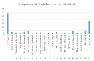
Graph 3
I also ran statistical analysis on the same mini-data set, using my TI-84 plus calculator, and came up within a mean number of song titles contributed by individual source of about 9.7, with a standard deviation of about 8.5. Of course, these numbers are a little off, as the number of entries was slightly higher than it should have been – I apparently double-counted something, which I now have to search out. The margin of error is fairly small, though.
What do we learn from this analysis? Well, the chart demonstrates quite neatly that most of the song titles were contributed by William Francis Allen and his cousin, C. P. Ware, two of the editors. The mean is probably less helpful, because those two editors are outliers in terms of their frequency of contribution. But the point of this exercise if, first and foremost, to look at the data a little differently, and if nothing else, reveals the uneven distribution of the slave songs accumulated in this source.
You must be logged in to post a comment.