The Evolution of Landscapes in Modern Japanese Prints
Japanese landscape prints have been evolving ever since Katsushika Hokusai and Ando Hiroshige first made them popular during the first half of the 19th century. They set the foundations for modern landscape prints. Some of their techniques were still visible in the works of artists of the 20th century such as Yamamoto Kanae, Minami Kunzo, Kawanishi Hide, and Toshi Yoshida, and even in the past few decades in the prints of the American artist, Micah Schwaberow.
Katsushika Hokusai first popularized landscapes during the first years of 1800. About thirty years later, Hiroshige started to also produce prints and gain popularity. Hokusai was not entirely pleased with his loss of popularity due to Hiroshige, and once commented about “whippersnapper artists who know nothing.” Though they were rivals, both are known as masters of landscapes today. At first glance, their styles are very similar, but with a deeper look, subtle differences appear.
During the mid 1800s, the Japanese government was trying to stabilize the economy by putting consumption laws in place. Prints of courtesans and actors were outlawed, and the numbers of colors to be used in each print were decreased. Depictions of historical characters and stories, still-lifes, and landscapes became extremely common. Hokusai and Hiroshige were publishing large quantities of landscapes during this time using more stronger, deeper, and more intense colors combined with the use of more overprinting. A few years later, the government began to relax restrictions and Hiroshige used more intense colors and overprinting than ever before, as did Hokusai, and also used the grain of the wood from the printing blocks more prominently.
In his prints, Hokusai did not like to be restricted by a style of a specific school and began to develop a personal style of his own. Shortly before 1798, he began to place more emphasis on the landscapes within his work. He started work on his famous “Thirty-six Views of Mt. Fuji” series in 1823 and traveled through the provinces around Fuji to get a feel for the countryside. His style comes through in this series with the use of asymmetry, realistic use of color, simplification, and emphasis of line.Asymmetry had the viewer’s eye fill in what was missing and to create aesthetic pleasure and simplification “to create a maximum of effect with a minimum of detail.” The people that are within many of his landscapes also illustrate a thorough understanding of the human body from the liveliness they exude. The combination of all his techniques form balanced and well executed prints.
 |
 |
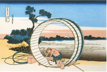
Two prints by Katsushika Hokusai. At left, “Fujimihara in the Province of Owari” (late 18th -19th Century) and at right, “Thunderstorm Below the Mountain” (1830-31). Both images are from his series, “Thirty-six Views of Mt. Fuji,” and display his realistic use of color and the use of gradations. Fujimihara also demonstrates his skill of portraying the human body, while Thunderstorm shows simplification and asymmetry.
Hiroshige wasn’t as rebellious towards schools as Hokusai was and much of his well-known work reflects the Shijo style, which used Chinese painting techniques in a Japanese context. The realism of this style appealed to Hiroshige. In 1830, after having done prints of women and actors for some time, he decided to work only on landscapes and pictures of birds and plants. His prints “represent a typically Japanese image of nature.” Hiroshige also used people, but only to “emphasize aspects of nature.” He also used planes of color to dominate the composition of his prints, whereas Hokusai and other artists of the time emphasized lines.
 |
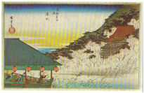 |
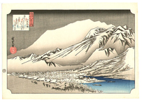
Two prints by Ando Hiroshige, at left “Evening snow at Hira” (1830) from the series “Eight Views of Omi,” and at right “Kiyomizu” from the series “Famous Places of Kyoto.” In Evening Snow, Hiroshige’s use of planes is clearly seen, and both images display gradation and realism. Kiyomizu also demonstrates his use of people to emphasize nature by the one man pointing towards the view on the hill from the corner of the structure.
Hokusai and Hiroshige used people commonly, but both the characters and the landscapes of these artists had very different feels. Hokusai’s landscapes were more simplistic and representational, and the people within them were very detailed and expressive. Hiroshige’s people are rather dull in their depictions, but the landscapes have a very realistic quality and often use vivid colors. The use of intense planes of color was brought to the modern woodblock prints, but outlines and the frequent use of people in the landscapes was more or less dropped.
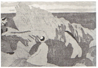
The work of Hokusai and Hiroshige was still in the realm of ukiyo-e prints, but in the early 1900s, the first creative woodblock prints were starting to be made. In 1904, Yamamoto Kanae, with help from Ishii Hakutei, were the first to bring a creative print to the attention of the public. This kind of creativity was unheard of at the time since the Japanese art establishment believed that woodblock prints were a commercial means of reproduction and was not worthy to be considered art. This started a movement called Sosaku-Hanga, which incorporated Western perspective and light effects into the woodblock prints. The artists in this movement would also create their own images, and then carve the blocks and print them instead of having artisans do the carving and printing as was done while prints were highly popular. In other prints by Yamamoto Kanae, he used flat areas just as Hiroshige’s prints did, but they were “boneless.” What this meant is that they were lacking the black structured outlines that blocked out the areas of color in ukiyo-e prints.
 |
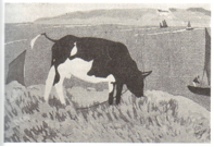 |
Prints by Yamamoto Kanae. At left, “Bathers of Brittany” (1913) and at right, “Small Bay of Brittany” (1913). Both prints demonstrate flat areas of color and the lack of outlines.
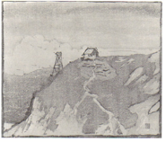
Another artist of the early 1900s in the Sosaku-Hanga style was Minami Kunzo. He had the first ever solo exhibition of woodblock prints by a living artist in Tokyo. In one of his prints, Observation Tower, he used shapes that were “freely and directly carved” and the color was applied in a style similar to watercolor in thin washes. The print has a “clean windswept feeling suggestive of the moist atmosphere near the shore of the Inland sea where Minami had lived as a boy.”
Minami Kunzo’s “Observation Tower” (1911-1913). The technique of overprinting was used in this print with thin washes of color. Even though it is in black and white, one can still feel the atmosphere of the piece.
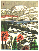
After seeing Yamamoto Kanae’s Small Bay of Brittany while he was in high school, Kawanishi Hide (1894-1965) taught himself how to carve and print woodblock prints. Like Kanae and Minami, he also used flat planes of color without using outlines and softly contoured shapes. Kawanishi loved the bright primary colors of ordinary poster paint.” Hiroshige also used bright colors, but Kawanishi took the use of intense colors even further, applying hues at full saturation to create a jarring composition that is his own style.
 |
 |
Prints by Kawanishi Hide. At left, “Snow at the Lakeside,” (1942) and at right, “View of Kobe Harbor” (mid 20th Century). Both show his soft, flat shapes and bright colors.
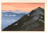
The artist Toshi Yoshida (1911-1995) began to focus his work on woodblock prints after 1950. Yoshida’s focus was on animal prints, but he also produced a number of landscapes. His first landscapes depict Japanese scenes and are a modern interpretation of traditional ukiyo-e prints. These did include some human figures, as Hokusai’s and Hiroshige’s landscapes did. A garden series of Yoshida’s landscapes use white outlines with bold colors to make assertive prints. This is an interesting inversion of the typical black (or another dark color) outline. Later in his life Yoshida also traveled to Africa where he did a number of landscapes including animals within the pictures.
 |
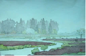 |
Two of Toshi Yoshida’s landscapes. At left, “Tsubakurodake, Evening” (1951) and at right, “Morinji in Spring” (1951). Both prints show some of his outlining, great use of color, and gradations.
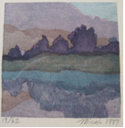
The work of those artists in the early and mid 1900s then brings us to the past few decades and the prints of Micah Schwaberow. He lived in Japan for a little over a year while he was learning to create prints from Toshi Yoshida, and has now been a printmaker for over 20 years. Schwaberow uses less outlining in his landscapes than Toshi does, therefore having planes of color giving the detail within his prints. Though he doesn’t use outlining, the colors and shapes he uses, combined with often extensive overprinting, define the areas of his pieces well and give them a great deal of depth. The technique of overprinting was used by most, if not all, of the artists mentioned.
 |
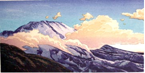 |
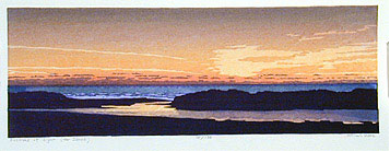
Two of Micah Schwaberow’s prints, “Reflections 3” (1987) and “Evening Light, Mt. St. Helens from Coldwater” (2000). Both prints display his muted yet pleasing colors, overprinting, and planes of color. Evening Light also shows the use of gradation.
Both Toshi and Schwaberow prints demonstrate a strikingly similar style to them, just as Hokusai’s and Hiroshige’s were. Similarly to Toshi, his colors are much more muted than the prints of previous artists, but still deep and rich. Similar to Minami’s Observation Tower print, Schwaberow uses the atmosphere of Santa Rosa, California in many of his prints along with watercolor-like washes of color.
A common link between Hokusai, Hiroshige, Toshi, and Schwaberow is the use of color gradations. Often used in the sky, one color will fade into another, gradually lighten or darken, or fade to white. This beautiful technique can be seen in works by each artist and seems almost unchanged from the examples of a hundred and fifty years ago.
Another print by Micah Schwaberow, “Festival of Light (for Sanae)” (2002). This print shows a strong use of color and gradation also.
Though landscape style woodblock prints have greatly changed since their first rise to popularity, we are still able to see some of the same basic techniques and styles being used throughout their evolution. All of the artists used at least one technique from artists prior to them, but they each had their own interpretation of it, each creating their own distinct styles. The evolutions of these styles are truly fascinating, and would be exciting to see the results of further changes in the future.
Bibliography
Narazaki, Muneshige. Hiroshige Famous Views. Trans. Richard L. Gage. Tokyo: Kodansha International, 1968. 22.
Keyes, Roger S. Japanese Woodblock Prints : a Catalogue of the Mary a. Ainsworth Collection. Bloomington, IN: Indiana UP, 1984. .57
Narazaki, Muneshige. Hokusai; the Thirty-Six Views of Mt. Fuji. Trans. John Bester. Tokyo: Kodansha International, 1968.
Narazaki, Muneshige. Hiroshige Famous Views. Trans. Richard L. Gage. Tokyo: Kodansha International, 1968.
Suzuki, Takashi. Hiroshige. London: Elek Books, 1959.
Merritt, Helen. Modern Japanese Woodblock Prints : the Early Years. Honolulu: University of Hawaii P, 1990. 126.
Merritt, Helen. Modern Japanese Woodblock Prints : the Early Years. Honolulu: University of Hawaii P, 1990. 158.
Merritt, Helen. Modern Japanese Woodblock Prints : the Early Years. Honolulu: University of Hawaii P, 1990. 127.
Merritt, Helen. Modern Japanese Woodblock Prints : the Early Years. Honolulu: University of Hawaii P, 1990. 230.
Skibbe, Eugene M. Yoshida Toshi : Nature, Art, and Peace. Edina, MN
“Micah Schwaberow.” Snapshots. Santa Rosa Public Access. Santa Rosa. 7 Apr. 2002.
